Paint Colors: Our Whole-Home Palette
So today I’m sharing my whole-home paint color palette with pictures and links for BOTH houses. Paint color questions are the most asked questions I get from readers, so I thought I would make it easy and create a MASTER post all about our paint, and will update it periodically as we make changes.
Our Previous House Colors.
The Esquire was the name of the floor plan for our previous house. Every room and the “before” photos can be enjoyed in our house tour. It was a labor of love, but we learned a lot about paint, how they behave in certain situations.
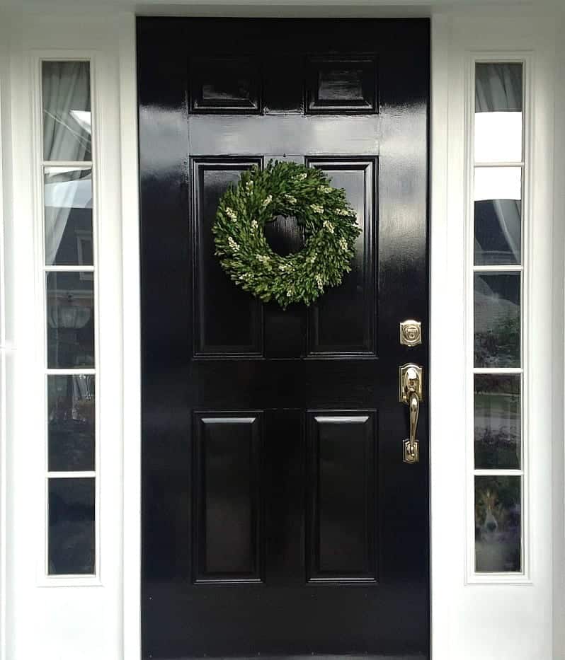
Black Door Paint in Previous House:
Rustoleum Professional High Performance Enamel: Black front doors are so classic, read my post about black front doors and what paint I used here.
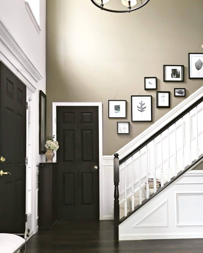
Paint Colors in Foyer & Main Living Area:
Discontinued, but this was on the can:
Lowes #0633 330-695-935 Tinter B
3/7/12 Valspar, Gallon Size, SR214, Moonlight Beach, Signature, Interior Satin Base 4
101-2Y, 107-2Y10, 109-14, 113-7Y28

- The entire first floor was painted primarily in Valspar, Moonlight Beach — but buyer beware!! Lowe’s no longer carries it by name. Use the number I gave you above.
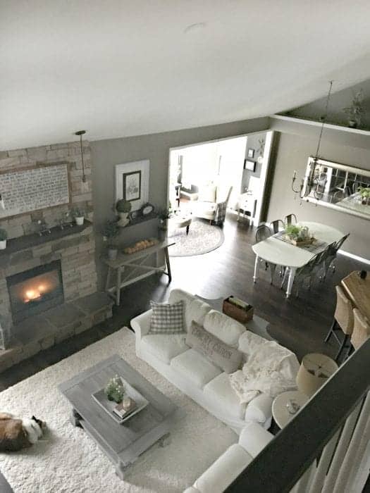
I love any hue with cooler undertones. For me, This color has a very “Zen” feeling to it, and while it’s mostly a taupe, I swear I remember seeing blue undertones being added as they mixed the paint. This color was a last minute decision. I walked into Lowe’s, my original intention was to opt for a safe choice…which was a lighter, non-dramatic color. But something about this darker hue was very comforting, so I went for it! Depending on how the light plays, the main living area always seems to look different. This is how I see my walls most days…a taupe-grey. But if the sun is shining directly in the foyer, that same color can look warmer and more brown on other days:
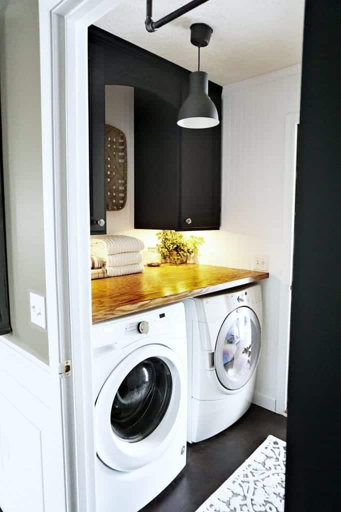
Paint Colors in Laundry Room
Cabinets: Iron Gate by Heirloom Traditions
Walls: Pegasus by Olympic painted on beadboard paneling
Wood Counter Top: Oak Plywood Stained with Early American by Varathane
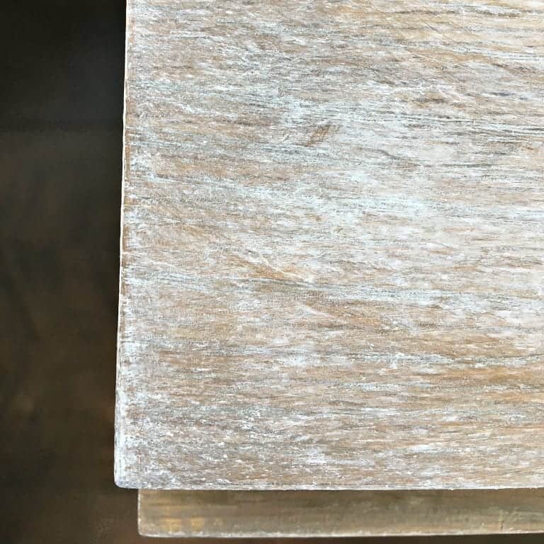
Floors: Pergo Molasses Maple
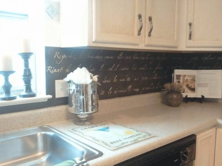
Stair Railings + Kitchen Backsplash:
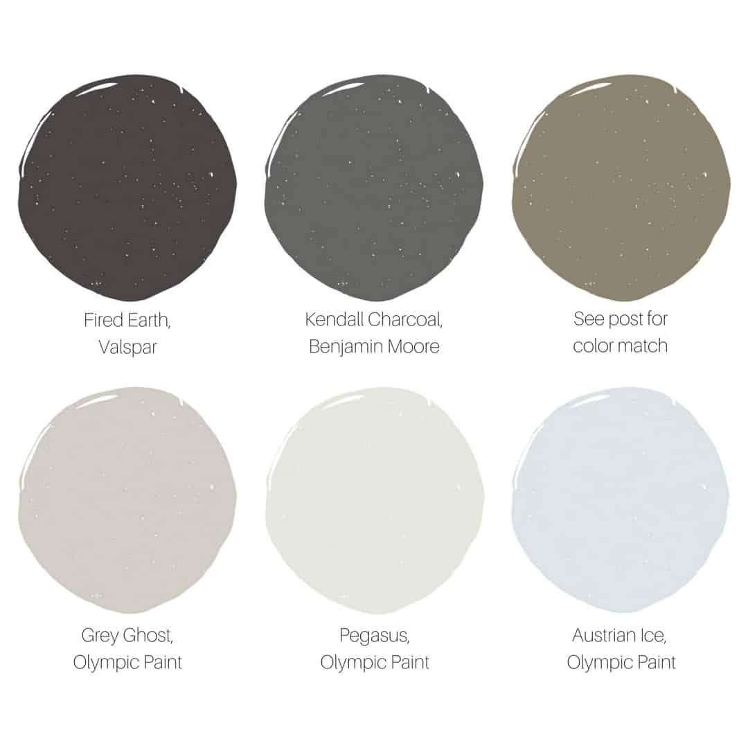
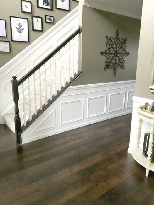
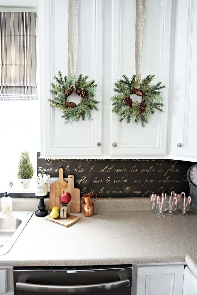
I first bought “Fired Earth” for the stair rail project. Later I was inspired to use it for the kitchen backsplash.
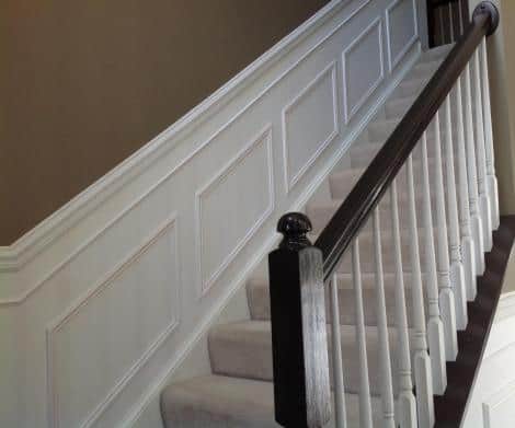
Both painted “Fired Earth” High Gloss by Valspar
I bought a high-gloss finish for this project which glides right on. The wainscoting is a pure white in a paint specifically made for trim which comes in a satin sheen — a slight gloss makes it easier to keep clean but I still find I need to touch it up every year.
At first, I was considering black for our railing but it looked way too harsh. Then I found Fired Earth which provided just enough brown undertones to soften the look.
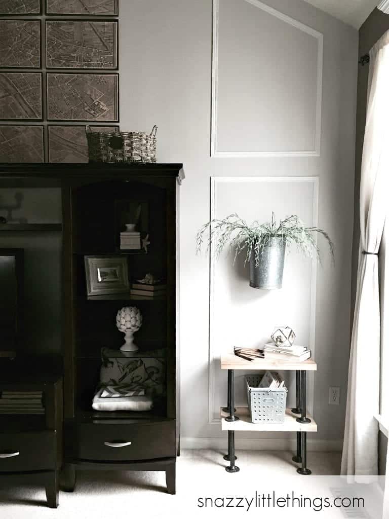
Paint Colors on Family Room Feature Wall
- Grey Ghost by Olympic Paint + Stain (see the post)
- Pegasus by Olympic Paint + Stain
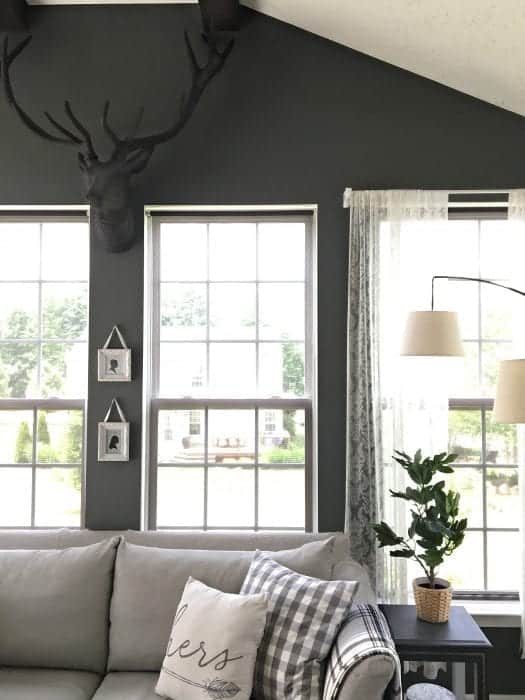
To break up the monotony of Moonlight Beach, our two story feature wall in the family room was painted in Grey Ghost. I liked how it looked against the adjacent walls in Moonlight beach. We painted the trim in Pegasus which looks like a pure white when paired with Grey Ghost.
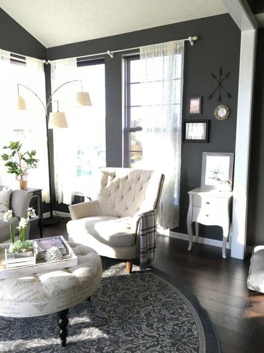
Paint Colors in Sunroom
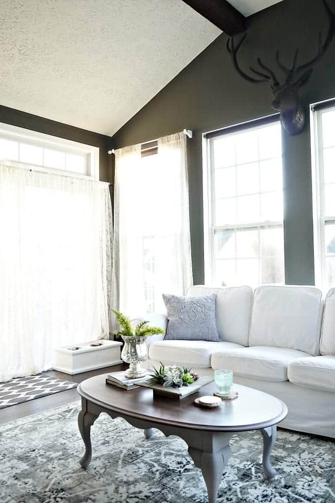
- Walls: Benjamin Moore, Kendall Charcoal (see the post)
- Wooden Beams: Dark Walnut Stain by Varathane (see the post)
I didn’t get our sunroom quite right the first time around. It was painted a pale beige. I was always very sensitive to the “vibe” against the Moonlight Beach. While they didn’t clash, they didn’t complement each other perfectly, either. I wanted something a little more bold and dramatic. And this new, bolder Kendall Charcoal from Benjamin Moore definitely offered the cooler undertones that I crave.
Office / Dining Room
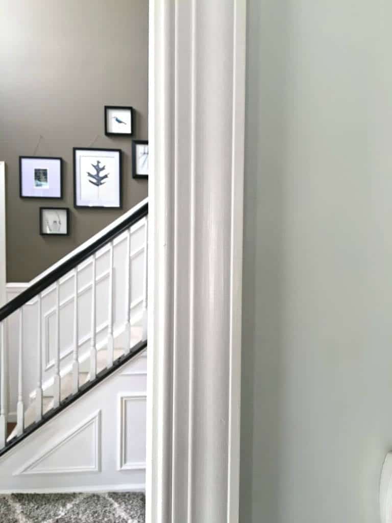
“Austrian Ice” Olympic Paint + Stain. I find grey-blues very soothing and a perfect complement to the darker, bolder colors in the rest of the house.This was painted years ago, and again the original paint color is no longer and I can’t find the original paint can. But this one is very close. Austrian Ice by Olympic is very close.
Paint Colors in Basement
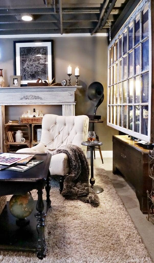
I am asked quite often, and all I can offer are photos of the paint can covers. I totally forgot to write the names of them down.
Paint Colors in the New House
We moved into our new house in August 2018. Our goal was to go lighter and brighter at a time when everyone else seems to embracing dark walls again. (I always seem to be off-trend). Lighter paint on the walls paired with darker furniture to add contrast and depth.
Paint Color First Floor:
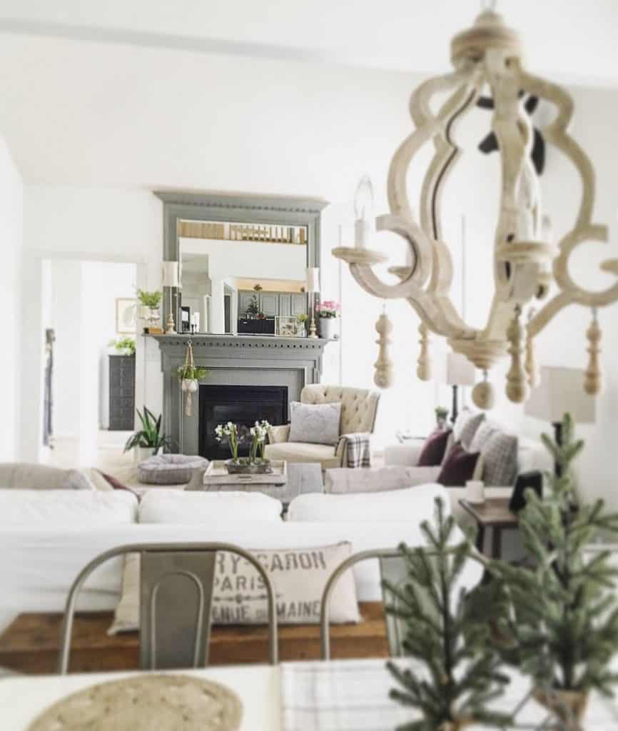
“Simply White” by Benjamin Moore is what we chose for our first floor in the new house.
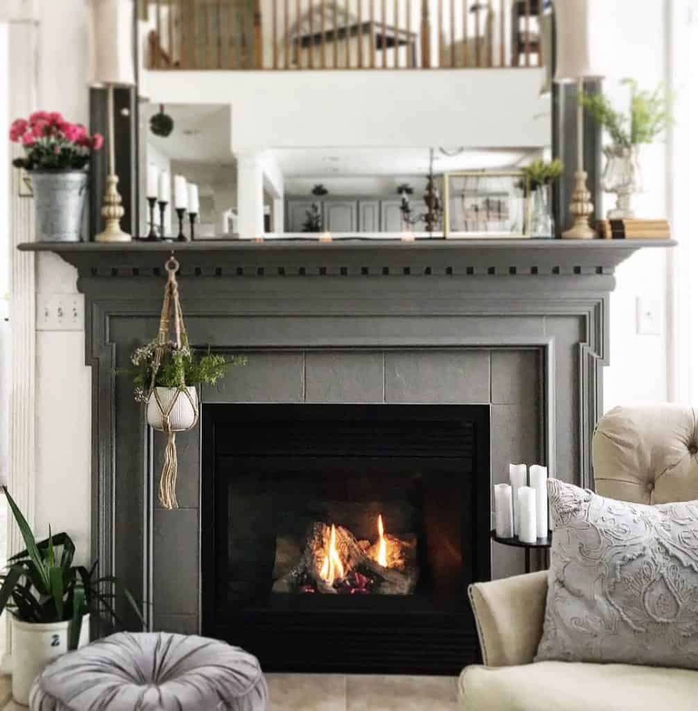
Paint Color Fireplace Mantel:
Garden Trowel by Magnolia (you can purchase it here) and you can see the before and after of the mantel transformation here.
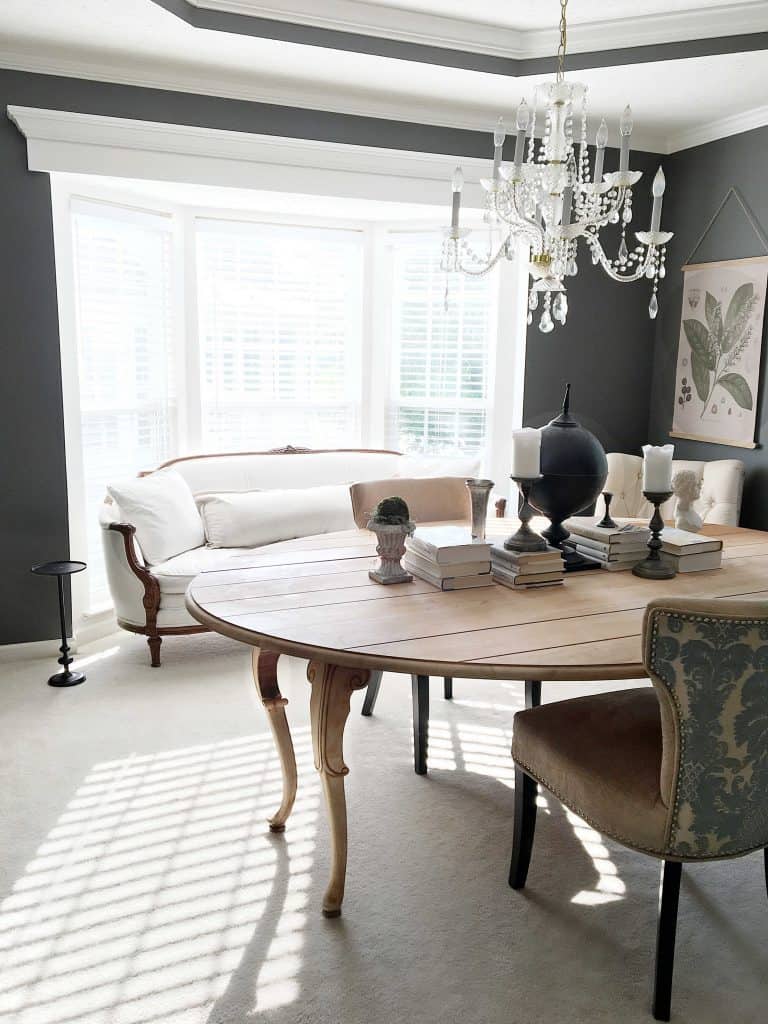
Paint Color in Dining Room
Paint Color in Dining Room: Kendall Charcoal. This was part of our foyer upgrade and we just kept going and painted this room too.
Choosing color is a big decision. I’ve made some wrong turns in the past — sometimes a color looks great in one season, but not in another. How a paint color looks in your home really can depend not only on the time of day, your physical location and the time of year, too!
Soon I’ll share some tips on how I choose paint colors, but for now – how do YOU do it? What are your favorite paint colors these days!







Love the colors you use. It is nice that you can use brown and black. I like both as accents in any room.
Thank you, Marty. Love all of your decorating ideas!
so, could you please share the names of the colors and who makes the paint (the 2 greys and beige) at the beginning of this site? Thank you.
Yes I edited to include that under the picture. But be warned, “Moonlight Beach” by Valspar is now an entirely NEW color…so you have to order t the paint at the Lowe’s counter using the paint formula / code that I provided in the blog post. Have a good day!
Thank you so much for this info on the colors for your main living area – it really solves a big problem that I [thought I] had! We are repainting out entire home in a color by Plascon called “Evasive White” – a very nice light grey. My corner suite in the TV section is a combination of taupe, black and cream stripes, and I was really worried about it fitting in with the light-grey walls and white accents. After seeing your pictures, though, I realize that I could easily match these colors, especially if I just add new scatter cushions to accentuate the light grey of the walls.
Thank you again!
Good point, making your colors blend with pillows is the best paint trick in the book! Generally if I’m really struggling with choosing a color (and I definitely do), I paint a large piece of cardboard and leave it up for a few days to see how the light plays on it. The subtle undertones are what I’m trying to match more than the colors themselves :)
It’s crazy how much paint can really update a space, loving those colors!
I now live alone (widowed two years ) in a condo and for continuity, had every room except the bathrooms painted the same color and haven’t tired of it yet. The previous house was similar to yours – open plan, two-storey foyer, vaulted living room, etc. Due to the ceiling heights, my husband didn’t want to balance on scaffolding anymore so we hired a painter. For the entrance, dining room, kitchen, bedroom hall and living room, we chose Benjamin Moore “Florentine Plaster”. We had the front main hall and a recessed wall in the dining room painted in B.M. “Ranchwood” which went very well with the former chosen color. When I first saw Florentine Plaster up in the living room (faced West) and the dining room (faced East), I just about died!! I hated it and was convinced I’d made a huge and costly error; one I would have to live with BUT after the second day, I loved it as the constantly changing sun exposure gave it a slightly different color as it (the sun) moved from East to West. I now see that color mentioned in many Canadian decor magazines. Paint decisions can be very intimidating – especially if you need to hire a professional painter!!
I totally agree, Elaine. I’m ready to change the main living room colors to a lighter shade (11 years, same four walls gets tiring) but it does work on this space. I am waiting to see what comes next after the grey trend. I’m honestly wishing I had near-white walls at the moment but that would probably start to feel like a hospital. And I’m sorry you lost your husband, I can’t imagine life w/o Mark :(
I LOVE all of your choices and thanks for the detailed information. I am also curious about the flooring. Can you provide information on what it is? Thanks
Thank you! The flooring is Pergo Outlast+ in Molasses Maple. I have an entire article series here on the blog sharing the before & afters of each room.
I love your ideas and colors. I have brown stained wainscoting all throughout my lower level and up my stairs. I also have honey oak cabinets in the kitchen with terracotta tile. It is so dark and outdated. I am looking for a country farmhouse look. I am having trouble trying to decide if I should paint all the wood trim and wainscoting and replace flooring. Or keep some of the brown. Any ideas?
I love your ideas and colors. I have brown stained wainscoting all throughout my lower level and up my stairs. I also have honey oak cabinets in the kitchen with terracotta tile. It is so dark and outdated. I am looking for a country farmhouse look. I am having trouble trying to decide if I should paint all the wood trim and wainscoting and replace flooring. Or keep some of the brown. Any ideas?