Paint Guide For Your Whole Home
Paint is a tough decision for many people. Today I’m sharing my paint color palette including photos and links to paint projects in BOTH houses.We made the mistakes so you don’t have to! Soon I’ll be releasing a paint guide that you can print and take with you to the hardware store to help you choose the right paint for your home projects. Enjoy the full tour of both homes here.
Previous House Paint Colors
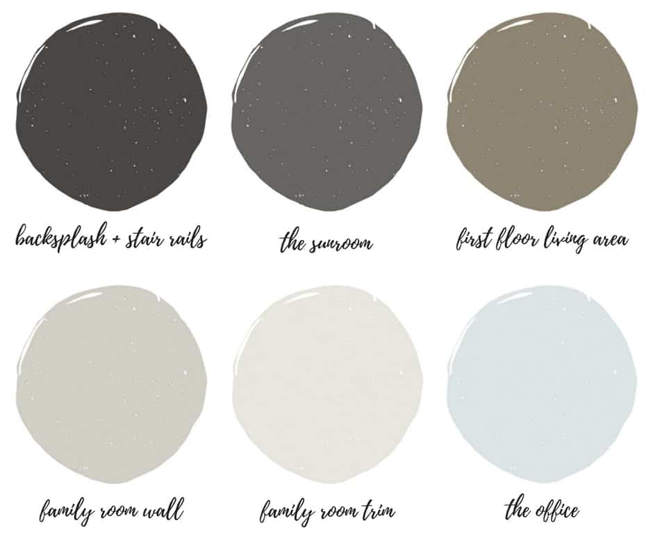
Interior color palette:
Modern Farmhouse ~ Soothing Undertones ~ Light Against Dark
I call our previous house “The Esquire” which was the name of the floor plan, you can take a house tour here. We opted for bold contrast and cooler colors with serene undertones. We also learned a lot about painting an open concept house. We experimented learned how the paint “behaves” in certain situations.
Black Door Paint (both houses)
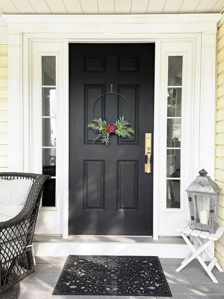
Black front doors are so classic that I chose the same paint for both houses. Read my post about black front doors and what paint I used here. I also shared another post about my painting interior doors black. The buyers of our previous house loved the look.
Exterior Black Door Paint
- Matte Finish (pictured): Heirloom Traditions Iron Gate. I have not tested this paint in the elements, it has very little exposure to rain. But it self-levels and is easy to clean and GORGEOUS. I also use this on our interior doors.
- Glossy Black: Rustoleum Professional Enamel Oil Based
Interior Black Door Paint
- Matte Finish: Heirloom Traditions Iron Gate. You will see my interior doors throughout this post.
Wall Paint Open Concept:
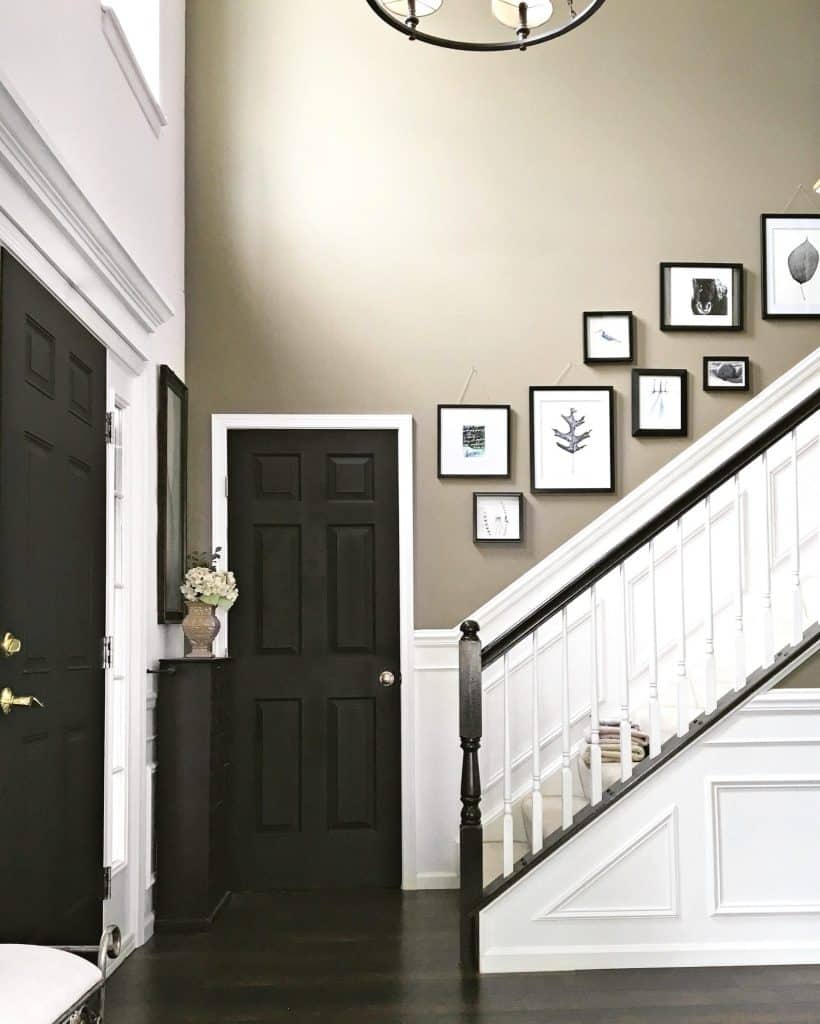
This is a custom paint color – use this exact formula: Lowe’s #0633 330-695-935 Tinter B 3/7/12 Valspar, Gallon Size, SR214, Moonlight Beach, Signature, Interior Satin Base 4
101-2Y, 107-2Y10, 109-14, 113-7Y28
This color has a very “Zen” feeling to it, and while it’s mostly a taupe, I swear I remember seeing blue undertones being added as they mixed the paint. My original intention was to opt for a lighter, non-dramatic color. But something about this darker hue was very comforting, so I went for it! Depending on how the light plays, the main living area always seems to look different. Most days it’s a taupe-grey. But if the sun is shining directly in the foyer, it can look warmer and more brown on other days:
DIY Wainscoting
Read our tutorial for DIY wainscoting here.
Wainscoting helped break up the darker aesthetic – and it’s the most popular project on the blog! I offer a full tutorial explaining how to measure and install this yourself. Installing wainscoting definitely adds value to your home.
- Interior Trim Paint: Acrylic Latex Perfect White (semigloss)
- Floors: Pergo Molasses Maple
Tip! Oil based paints or enamels yellow over time. For white finishes, I choose paints that are water based.
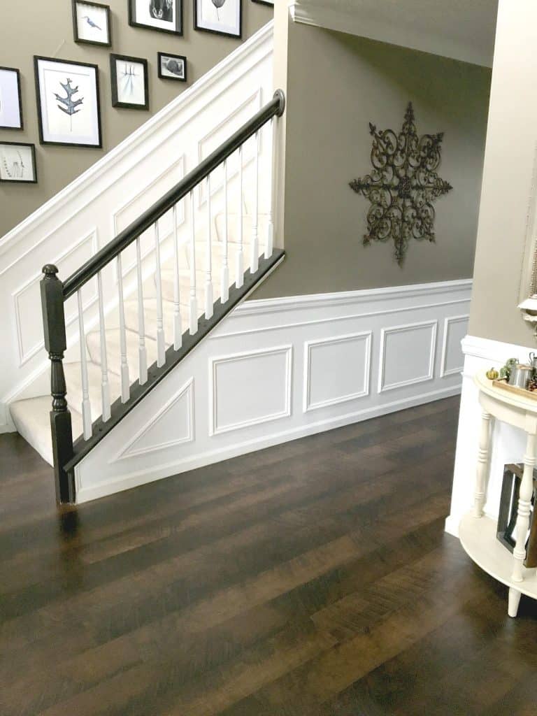

Painted Stair Railings:
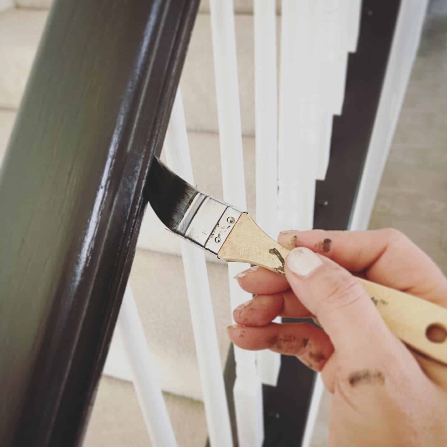
Read the tutorial: “How to Paint Stair Railings“
- Primer: Kilz primer
- Banister Color: Fired Earth” by Valspar (Gloss)
- White Spindles: Magnolia White trim paint
- Topcoat: (Gloss)
Fired Earth isn’t a harsh black. It has enough brown undertones to soften the look. I bought a high-gloss finish for this project which glides right on. The hand rails will need a top coat, be sure to buy a sheen that matches the rest.
Tip! I save time and avoid using painters’ tape. Imaging taping off over hundreds of railings? There is a better way (see my trick for painting stair railings quickly).
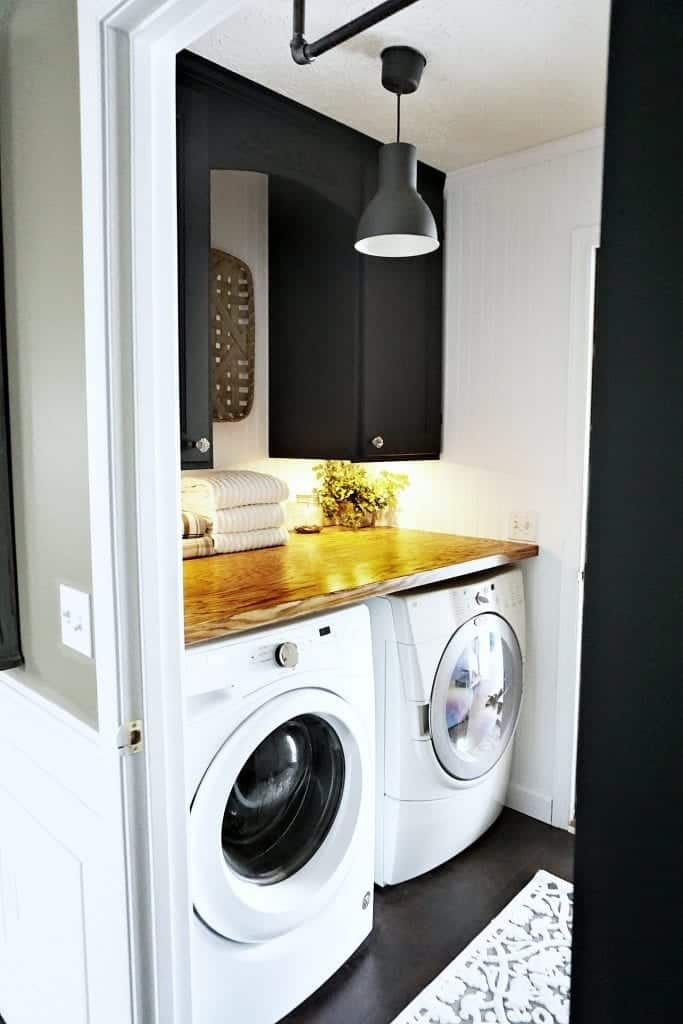
Modern Farmhouse Laundry Room
- Cabinets: “Iron Gate” by Heirloom Traditions
- Walls: “Pegasus” by Olympic painted on beadboard paneling
- Wood Counter Top: Oak Plywood Stained with “Early American” by Varathane
- Floors: Pergo Molasses Maple
Read about the laundry room project here.
Painting Open Grain Cabinets
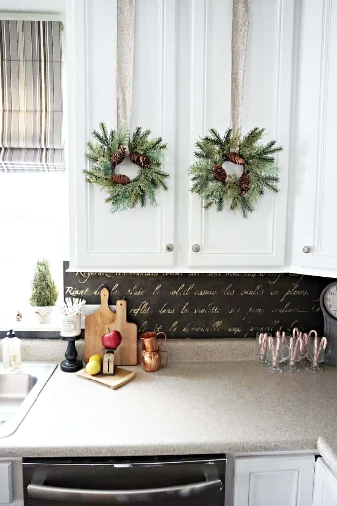
If painting your open grain cabinets, you MUST fill the grooves with a grain filler. This is THE most important step if you want a professional finish. See the tutorial here.
Painting Open Grain Cabinets White:
- Light Sanding followed by Kilz Primer (White)
- Grain Filler (followed by light sanding)
- DecoArt Satin Enamels (2-3 coats) no topcoat needed
Backsplash: Fired Earth High Gloss by Valspar. See the tutorial here.
Read about ALL of our kitchen projects! Lots of lessons learned!
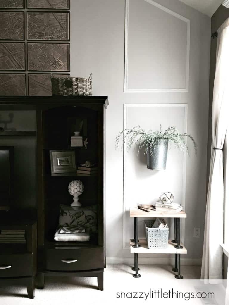
Paint Colors on Family Room Feature Wall
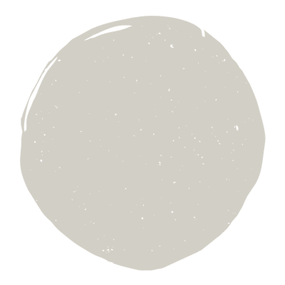
- Grey Ghost by Olympic Paint + Stain
- Pegasus by Olympic Paint + Stain
To break up the monotony of the dark walls in our main living area, we added this feature wall in the family room. We painted it Grey Ghost. I liked how it looked against the adjacent walls. We painted the trim in Pegasus which looks like a pure white when paired with Grey Ghost.
Paint Colors in Sunroom
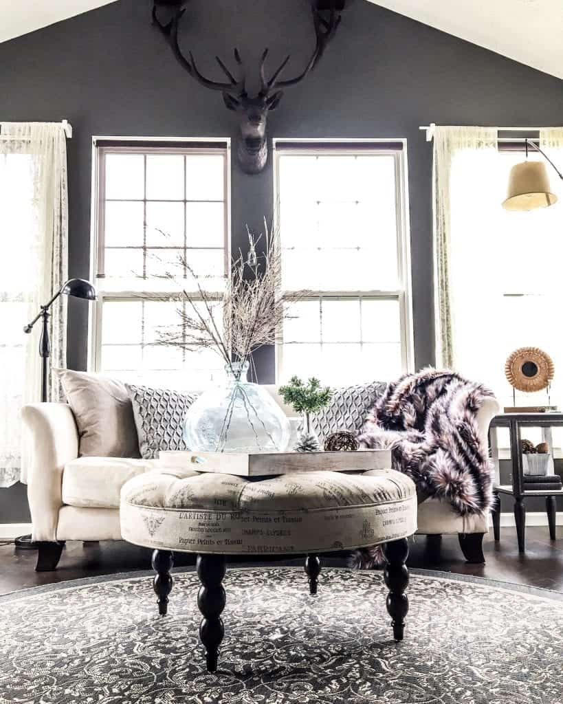
- Sunroom Walls: Benjamin Moore, Kendall Charcoal (see the post)
- DIY Wooden Beams: Dark Walnut Stain by Varathane (see the post)
I didn’t get our sunroom quite right the first time around. It was painted a pale beige. I was always very sensitive to the “vibe” against the Moonlight Beach. While they didn’t clash, they didn’t complement each other perfectly, either. I wanted something a little more bold and dramatic. And this new, bolder Kendall Charcoal from Benjamin Moore definitely offered the cooler undertones that I crave.
Office / Dining Room
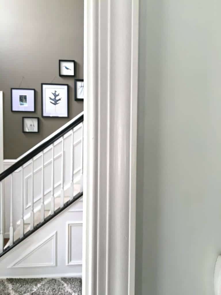
“Austrian Ice” Olympic Paint + Stain.
I find grey-blues very soothing and a perfect complement to the darker, bolder colors in the rest of the house. This was painted years ago, and again the original paint color is no longer and I can’t find the original paint can. But this one is very close.
Paint Colors in Basement
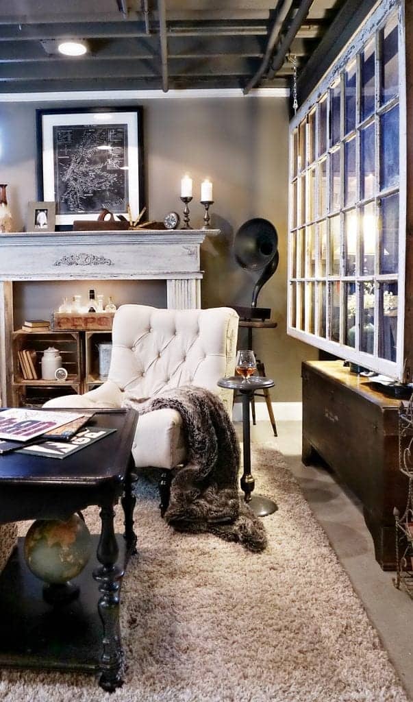
Scannable SKUs are available in our full tour of the basement here. I am asked quite often, but these are custom colors that we had mixed.
paint colors in my daughter’s bedroom
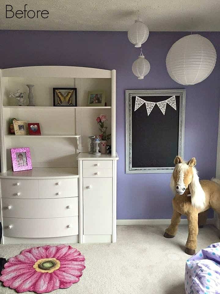
Wall Paint: Hyacinth by Behr, Found at Home Depot
See her teen bedroom remodel here.
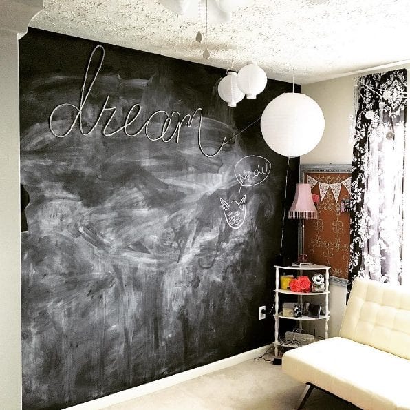
Chalkboard wall
Read about her large-scale chalkboard wall project here.
NEW House Paint Colors
Whites ~ Woods ~ Gray-Green Undertones ~ French Inspired
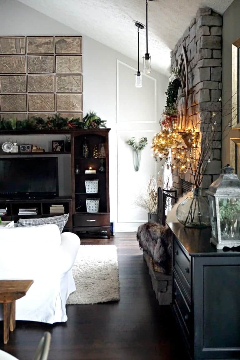
We moved into the Picket Fence house in August 2018. This time we chose to go lighter and brighter at a time when Instagram designers seem to be embracing dark walls again. (I always seem to be off-trend!) Lighter paint on the walls paired with darker furniture to add contrast and depth. Gray-green undertones seems to be the direction we are going.
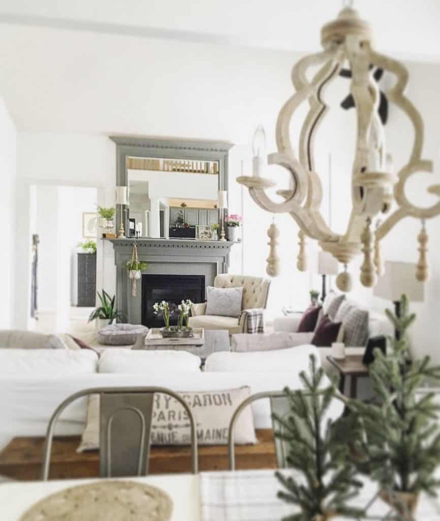
Paint Color Main Floor:
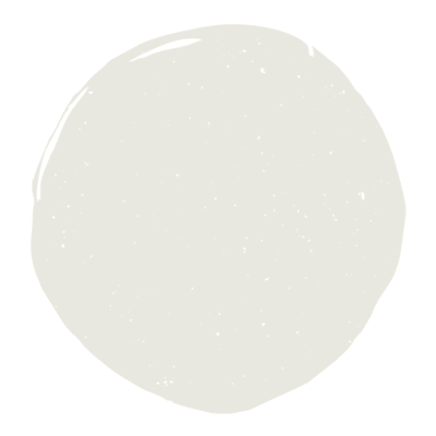
“Simply White” by Benjamin Moore is what we chose for our first floor in the new house.
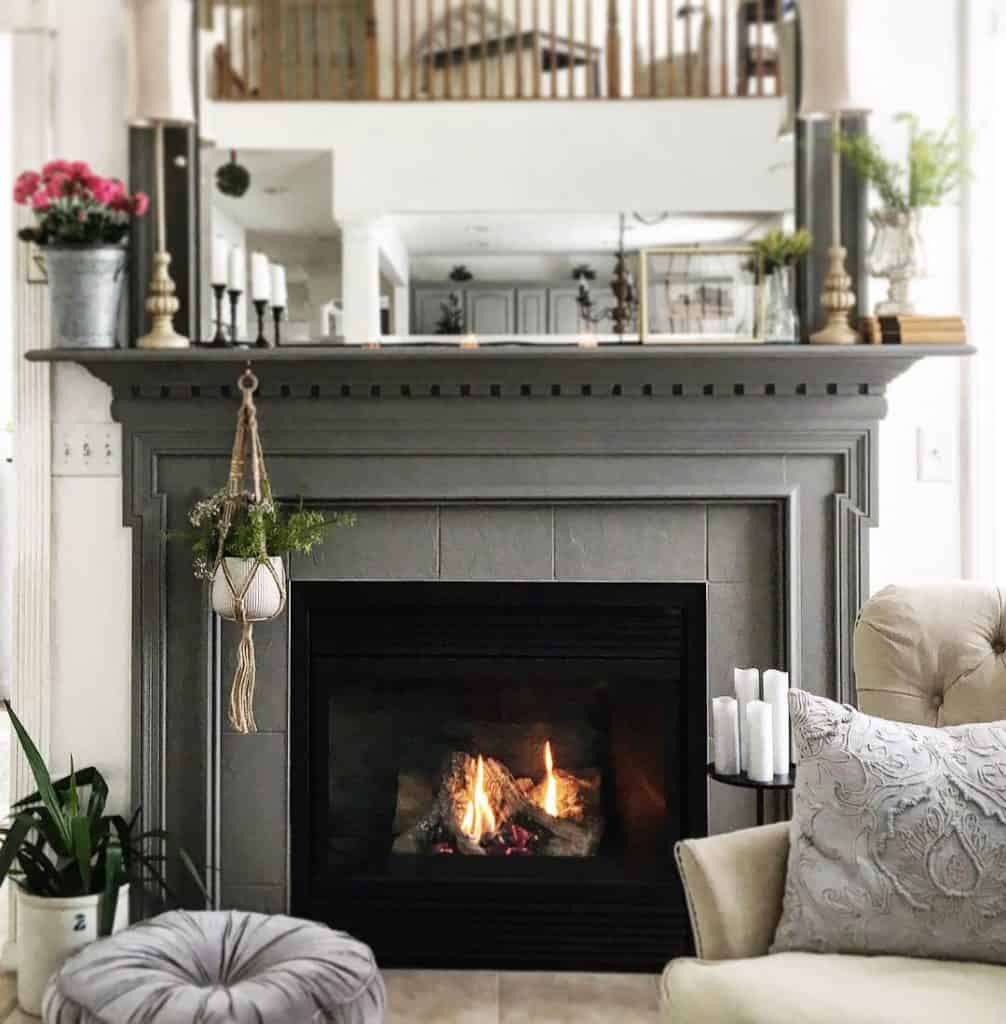
Paint Color Fireplace Mantel:
“Garden Trowel” by Magnolia
(you can purchase it here) and you can see the before and after of the mantel transformation here.
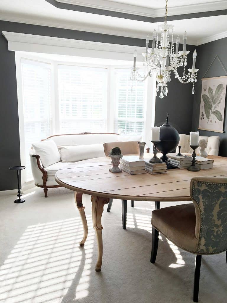
Paint Color in Dining Room
“Kendall Charcoal” by Benjamin Moore
This color was decided after we finished our foyer trim upgrade and paint project so we just kept going and painted this room too.
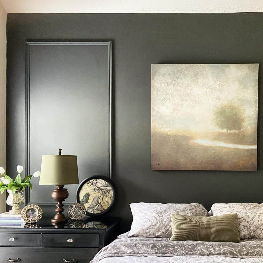
Paint Colors Master Bedroom Feature Wall
“Pond Stone” found at Ace Hardware by Magnolia. Read the post here. This room is a work in progress.
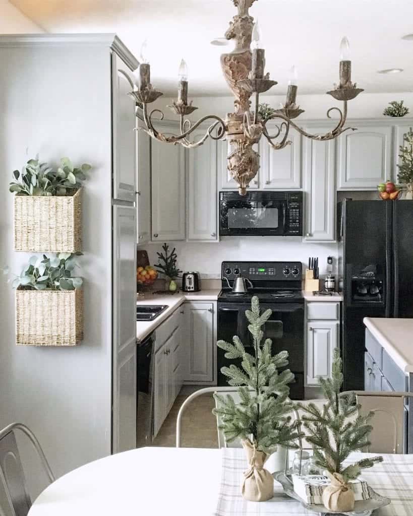
$95 Kitchen Remodel with Paint
“Galveston Gray” – this is a special request at Lowe’s. I had this mixed in a tintable enamel made by Valspar.
This time we wanted to choose our own paint colors for the cabinets. This popular makeover all happened with a can of Valspar Cabinet Enamels paint. I had Lowe’s tint it using the formula for “Galveston Gray” by Benjamin Moore. The trick: Clean. Light sanding. PRIME. Have water on-hand…lots of thin layers. No top coat needed. Do it right and you’ll be the next person giving it a good review.
Paint Colors in Guest Bedroom
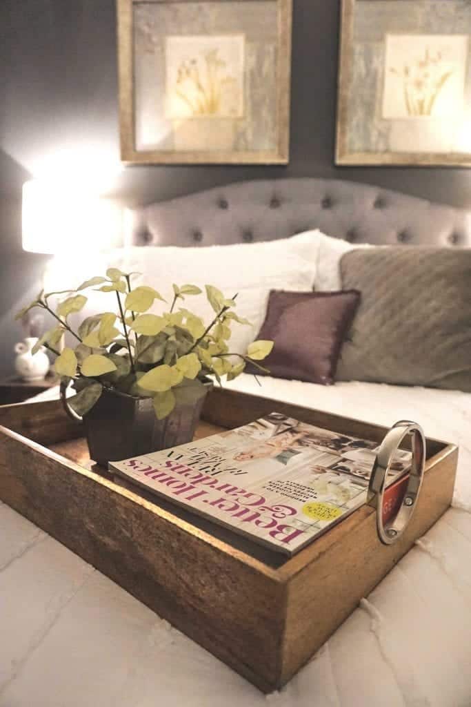
Wall Paint: “Kendall Charcoal” by Benjamin Moore
We totally transformed this room for around $500 and created a full guest suite in our basement using existing furniture and a few new purchases.
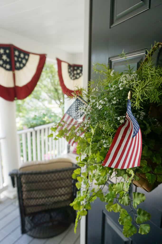
Black Door Paint:
“Iron Gate” by Heirloom Traditions
All of our interior doors are also painted this color. A bonding chalk paint – without the chalky finish. Dries a smooth matte. You can purchase it on Amazon.
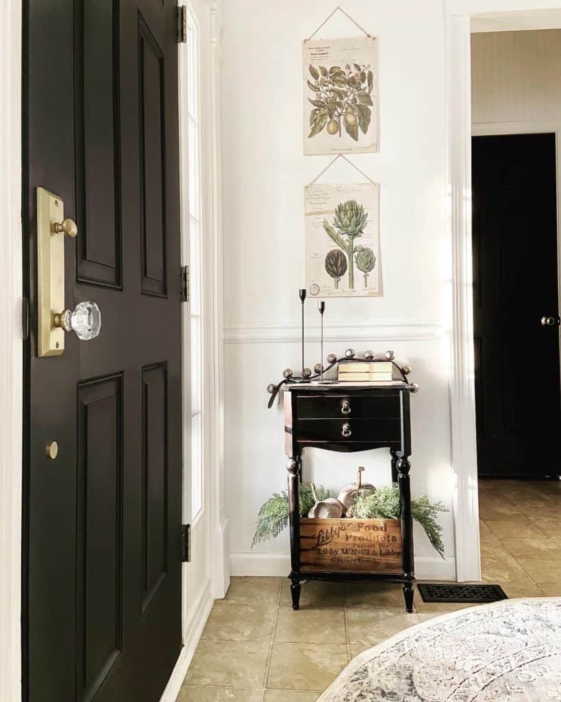
Black Interior Doors
“Iron Gate” by Heirloom Traditions
After learning the hard way, this is my go-to black paint. In this photo Heirloom Traditions goes on smooth and has a pretty matte finish without the chalky feel. And it’s easy to clean with a microfiber cloth.
Paints & Sheens (Our Favorites):
- Walls: We typically choose eggshell, or a washable matte latex paint for main living areas. We avoid any gloss sheen on walls. The color remains truer this way.
- Bathroom Walls: A washable satin, light sheen but easy to clean.
- Stair Railings: Prime first. Followed by 2 coats of our color choice in a glossy latex. Followed by 2-3 coats of a polyurethane to prevent chipping.
- Trim: 2 coats of a bright white in a latex, semi-gloss finish. No topcoat.
- White Cabinets: Clean, sand, prime. If a deep grain, we use a grain filler. Lightly Sand. Followed by 2 coats of a water based enamel (water based is typically non-yellowing). No top coat needed for a hard drying enamel.
- Cabinetry with Color: Water based enamel, since it’s a color it could be water based or oil. Oil can yellow so it depend on the hue.
- Topcoat: Polyurethane is used on high traffic areas like railings. I avoid top coats on cabinets and it’s not necessary if you use enamel which dries hard.
If you’re still trying to figure out your style or you color palette, read my post “7 Tips: How to Find Your Decorating Style”. Choosing color is a big decision. I’ve made some wrong turns in the past — sometimes a color looks great in one season, but not in another. How a paint color looks in your home really can depend not only on the time of day, your physical location and the time of year, too!
What are your favorite paint colors these days? I’ll be sharing my printable paint guide very soon! Stay tuned!




I have a question. Did you use any kind of finish when you painted your doors with Irongate? I’m thinking of doing the same thing but need the particulars. Thanks, love your doors.
Hi Sharon, no top coat needed with this paint! It’s also on my exterior door – but keep in mind it’s protected from direct elements because of the porch. But I have a feeling it would be ok. For the interior doors it’s super durable, and such a pretty matte finish. Here is a blog post: https://www.snazzylittlethings.com/black-interior-doors/ — I apply it using a foam roller with a 2″ nylon paint brush.
Crazy question: did you paint all of your interior doors black?